The World Cup captivates audiences not only with its high-stakes matches but also with its unique aesthetic, notably the varied designs of the kits. This article examines the away kits of all 48 teams, where designers often take creative liberties.
Swiss Kit: A Play on Passports
The Swiss away kit, like the home version, is inspired by passports. Unfortunately, this yields a color that feels out of place, more akin to a crossing guard’s attire.
Saeta’s Offering for Haiti
Haiti’s away kit, produced by lesser-known brand Saeta, fails to impress despite the palm tree pattern on the back offering a touch of creativity.
Norway’s Monochrome Approach
Norway’s away kit sticks to an entirely black theme, reportedly inspired by Viking warriors. This bold choice leaves no room for additional color contrast.
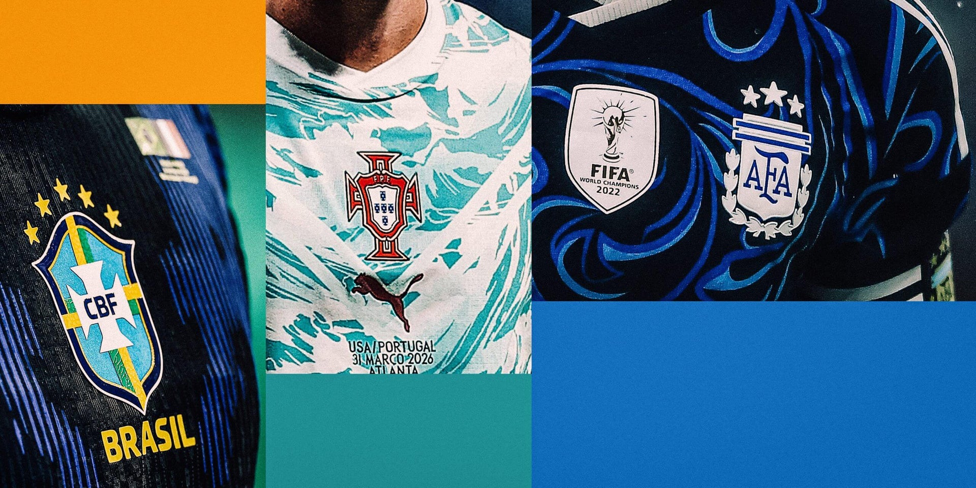
Puma’s Nod to Portuguese Icons
Puma claims Portugal’s away design is an homage to iconic players, though the ocean-themed pattern and triangle cut-out don’t quite convincingly support this narrative.
Qatar’s Simple White Design
Adidas appears to have kept things simple for Qatar, incorporating maroon stripes down the sleeves on an otherwise plain white shirt.
Canada’s Dusty Inspiration
Canada’s away kit resembles a T-shirt accidentally dusted during home renovations, featuring an unappealing pattern of white dust-like marks.
Croatia’s Blue Variation
Using the same design as their home kit, Croatia’s away shirt in blue feels more subdued, avoiding a clash with the iconic checkered tradition.
Scotland’s Understated Kit
Scotland opts for a low-key blue design with gold trim, which lacks the personality of its home version.
Austria’s Floral Attempt
A ustria incorporates a floral-inspired design, although the pale purple color choice struggles to make a resounding impact.
Kelme’s Pinstripes for Cape Verde
This away kit features a white torso with blue sleeves and pinstripes, offering a strong contrast for a sharper look.
U.S. Stars and Stripes Concept
The U.S. away kit features the iconic stars from the flag, creating an American theme that emphasizes national identity.
Ghana: Market-Inspired Boldness
Ghana’s shirt, inspired by the Makola market, stands out with its strong gold color and intricate background design, prioritizing boldness over subtlety.
Brazil’s Rorschach Experiment
Brazil uses a Rorschach-type design allegedly inspired by the rainforests’ poison dart frog, blending tradition with modern creativity.
Cape Verde’s Airborne Inspiration
The flight path design on Cape Verde’s away shirt doesn’t translate as well in white, giving a somewhat unfinished appearance.
Czech’s Crystal Inspiration
Puma designs suggest a crystal inspiration, though the execution results in a pattern reminiscent of household frosted glass.
Egypt and Iconic Imagery
Adorned with pyramid motifs, Egypt’s away shirt potentially offers visual intrigue for those who restrict detailed scrutiny.
South Africa’s Dynamic Design
Featuring a fading pattern between the top and bottom halves, Umbro creates a design that would seamlessly combine with the home kit.
New Zealand’s Breath of Life
The swirling designs on New Zealand’s kit intend to capture the spirit of the country’s elements, creating a dynamic visual.
Iran’s Cheetah Influence
Incorporating the Asiatic cheetah, Iran’s away kit impresses with a bold red backdrop, enhancing the feline motifs on the sleeves.
Mexico’s Retro Vibes
Mexico channels the 1980s for its away shirt design, balancing vibrant greens with classic trims for a nostalgic appearance.
Argentina’s Artistic Inspirations
Adidas keys into Argentina’s artistic culture, crafting patterns that require trust in their cultural authenticity, sporting hues that accent a past-favorite style.
Jordan’s Chivalry in Red
Embracing red with white trims, Jordan offers a simple counterpart to their home kit, drawing on team identity and tradition.
Algeria’s Hidden Patterns
An elusive pattern intended to reflect Algeria’s varied landscapes adds subtle detail to an otherwise clean shirt design.
Saudi Arabia’s Classic Simplicity
The understated combination of gold and green against a white backdrop enhances understated elegance.
Austria: Coffee House Culture
Austrian design channels Viennese coffee lore, creating a tastefully complex shirt echoing the brewing hub’s complexities.
Curaçao’s Vibrant Yellow
Away from their usual blue, Curaçao bursts onto the scene with a striking yellow kit offset by blue and red accents.
In summary, the array of World Cup away kits offers a fascinating glimpse into team identities and designer creativity. As the tournament progresses, these distinctive styles will undoubtedly capture both the players’ performances and the audience’s imagination.